ShopDreamUp AI ArtDreamUp
Deviation Actions


![[Tutorial] Clothes wrinkles](https://images-wixmp-ed30a86b8c4ca887773594c2.wixmp.com/f/7aa782f3-fc67-4ab0-9f19-c8a763be2b9a/dbx4n5c-189a5283-a776-47f4-97b6-907e95235adb.png/v1/crop/w_184,h_184,x_38,y_0,scl_0.16727272727273,q_70,strp/_tutorial__clothes_wrinkles_by_kuri_nyann_dbx4n5c-92s-2x.jpg?token=eyJ0eXAiOiJKV1QiLCJhbGciOiJIUzI1NiJ9.eyJzdWIiOiJ1cm46YXBwOjdlMGQxODg5ODIyNjQzNzNhNWYwZDQxNWVhMGQyNmUwIiwiaXNzIjoidXJuOmFwcDo3ZTBkMTg4OTgyMjY0MzczYTVmMGQ0MTVlYTBkMjZlMCIsIm9iaiI6W1t7ImhlaWdodCI6Ijw9ODcyIiwicGF0aCI6IlwvZlwvN2FhNzgyZjMtZmM2Ny00YWIwLTlmMTktYzhhNzYzYmUyYjlhXC9kYng0bjVjLTE4OWE1MjgzLWE3NzYtNDdmNC05N2I2LTkwN2U5NTIzNWFkYi5wbmciLCJ3aWR0aCI6Ijw9MTYwMCJ9XV0sImF1ZCI6WyJ1cm46c2VydmljZTppbWFnZS5vcGVyYXRpb25zIl19.4DqIPQG2lXd4VXuNu1TveGGZ6EWnublkqUm7YpR4d3A)
![[Tutorial] Clothes wrinkles](https://images-wixmp-ed30a86b8c4ca887773594c2.wixmp.com/f/7aa782f3-fc67-4ab0-9f19-c8a763be2b9a/dbx4n5c-189a5283-a776-47f4-97b6-907e95235adb.png/v1/crop/w_92,h_92,x_19,y_0,scl_0.083636363636364,q_70,strp/_tutorial__clothes_wrinkles_by_kuri_nyann_dbx4n5c-92s.jpg?token=eyJ0eXAiOiJKV1QiLCJhbGciOiJIUzI1NiJ9.eyJzdWIiOiJ1cm46YXBwOjdlMGQxODg5ODIyNjQzNzNhNWYwZDQxNWVhMGQyNmUwIiwiaXNzIjoidXJuOmFwcDo3ZTBkMTg4OTgyMjY0MzczYTVmMGQ0MTVlYTBkMjZlMCIsIm9iaiI6W1t7ImhlaWdodCI6Ijw9ODcyIiwicGF0aCI6IlwvZlwvN2FhNzgyZjMtZmM2Ny00YWIwLTlmMTktYzhhNzYzYmUyYjlhXC9kYng0bjVjLTE4OWE1MjgzLWE3NzYtNDdmNC05N2I2LTkwN2U5NTIzNWFkYi5wbmciLCJ3aWR0aCI6Ijw9MTYwMCJ9XV0sImF1ZCI6WyJ1cm46c2VydmljZTppbWFnZS5vcGVyYXRpb25zIl19.4DqIPQG2lXd4VXuNu1TveGGZ6EWnublkqUm7YpR4d3A)


![[Tutorial] Semirealistic Eye](https://images-wixmp-ed30a86b8c4ca887773594c2.wixmp.com/f/3c240104-e28d-4f4f-b1f4-9313691fefe3/d5rnsro-0b0c83c8-a459-482a-b514-7515578f1fc9.jpg/v1/crop/w_184,h_184,x_0,y_106,scl_0.184,q_70,strp/_tutorial__semirealistic_eye_by_teralilac_d5rnsro-92s-2x.jpg?token=eyJ0eXAiOiJKV1QiLCJhbGciOiJIUzI1NiJ9.eyJzdWIiOiJ1cm46YXBwOjdlMGQxODg5ODIyNjQzNzNhNWYwZDQxNWVhMGQyNmUwIiwiaXNzIjoidXJuOmFwcDo3ZTBkMTg4OTgyMjY0MzczYTVmMGQ0MTVlYTBkMjZlMCIsIm9iaiI6W1t7ImhlaWdodCI6Ijw9MzMwNyIsInBhdGgiOiJcL2ZcLzNjMjQwMTA0LWUyOGQtNGY0Zi1iMWY0LTkzMTM2OTFmZWZlM1wvZDVybnNyby0wYjBjODNjOC1hNDU5LTQ4MmEtYjUxNC03NTE1NTc4ZjFmYzkuanBnIiwid2lkdGgiOiI8PTEwMDAifV1dLCJhdWQiOlsidXJuOnNlcnZpY2U6aW1hZ2Uub3BlcmF0aW9ucyJdfQ.rXs8w9pb3Q0Wffw9Vs0jDTTe9wsBvwpCM533Fv6MVdU)
![[Tutorial] Semirealistic Eye](https://images-wixmp-ed30a86b8c4ca887773594c2.wixmp.com/f/3c240104-e28d-4f4f-b1f4-9313691fefe3/d5rnsro-0b0c83c8-a459-482a-b514-7515578f1fc9.jpg/v1/crop/w_92,h_92,x_0,y_53,scl_0.092,q_70,strp/_tutorial__semirealistic_eye_by_teralilac_d5rnsro-92s.jpg?token=eyJ0eXAiOiJKV1QiLCJhbGciOiJIUzI1NiJ9.eyJzdWIiOiJ1cm46YXBwOjdlMGQxODg5ODIyNjQzNzNhNWYwZDQxNWVhMGQyNmUwIiwiaXNzIjoidXJuOmFwcDo3ZTBkMTg4OTgyMjY0MzczYTVmMGQ0MTVlYTBkMjZlMCIsIm9iaiI6W1t7ImhlaWdodCI6Ijw9MzMwNyIsInBhdGgiOiJcL2ZcLzNjMjQwMTA0LWUyOGQtNGY0Zi1iMWY0LTkzMTM2OTFmZWZlM1wvZDVybnNyby0wYjBjODNjOC1hNDU5LTQ4MmEtYjUxNC03NTE1NTc4ZjFmYzkuanBnIiwid2lkdGgiOiI8PTEwMDAifV1dLCJhdWQiOlsidXJuOnNlcnZpY2U6aW1hZ2Uub3BlcmF0aW9ucyJdfQ.rXs8w9pb3Q0Wffw9Vs0jDTTe9wsBvwpCM533Fv6MVdU)


Description
Tutorial: How to shade clothes
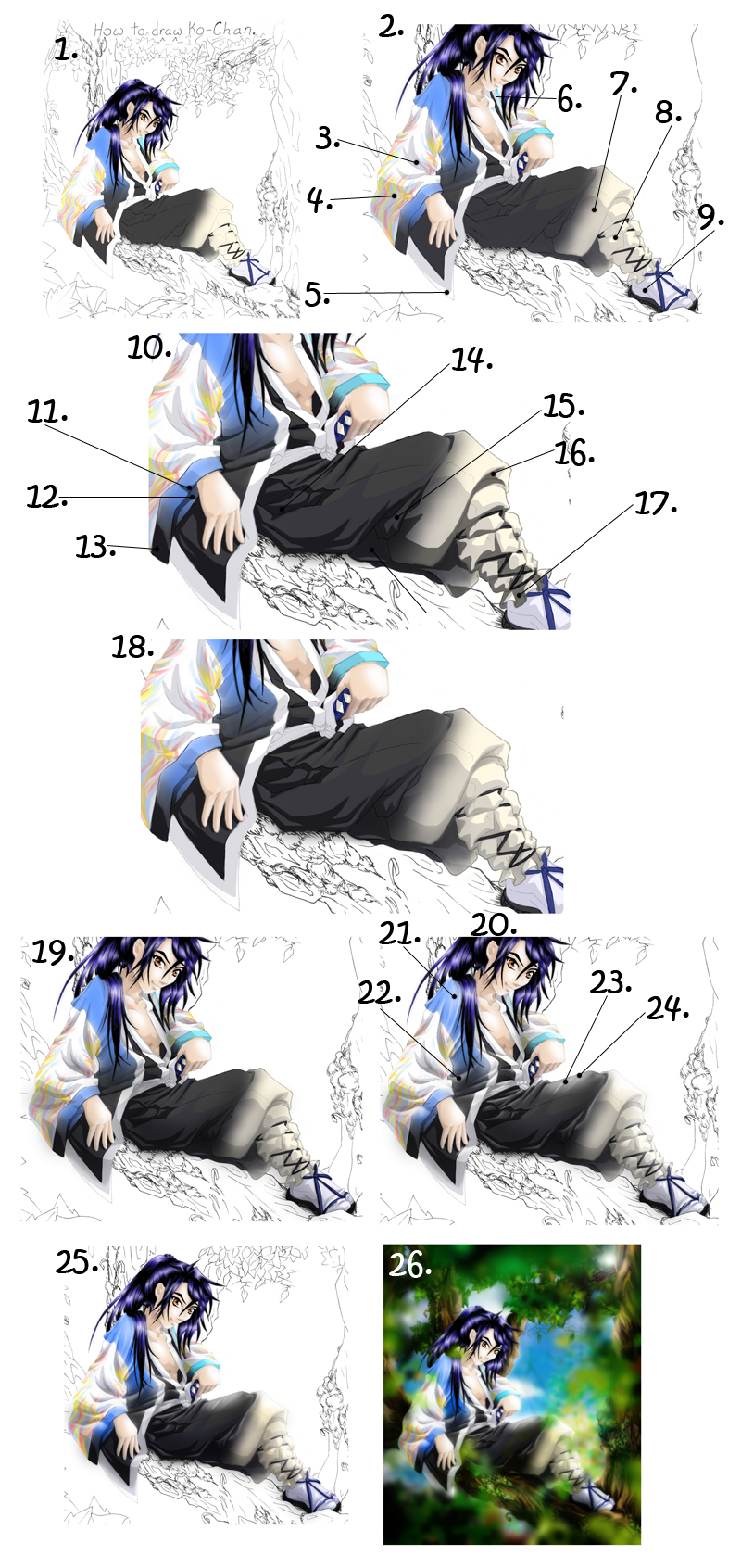
This tutorial is a guide to help shading in general. It focused on use in photoshop, but it can aid people doing traditional art as well. My hope is that you can use this for general anime drawing, but you can also use it to try to recreate this picture exactly. If you do, please remember to give me credit for the original character and the original drawing. That being said lets begin.
1. You need to have all the base colors already drawn. coloring Ko-Chan’s clothes, click here . If you want to draw these clothes exactly, here is a tutorial that might help. It also talks a little about doing flames and doing color progressions in photoshop.
2. Make a new layer for the shadows. This layer will be 15% opaque, and the color you will use will be a dark dark blue. Number 0A0A33. The first shadows will be bigger, filling large areas of color, and you can even be done shading after this step if you want. Make sure that the edges are clean. What I do is first just put the color in the places I need it, and then worry about getting it perfect by using a smudge tool that is 100% hard to push things back into place.
3. These next few steps will focus on where the shadows should go. Where you have large folds, you need to put a shadow that is on the bottom of the fold (this is assuming the light is coming from above) and inside the folds.
4. Where a sleeve bends away from the light source (in this case the lower left of the sleeve) you want to color the whole thing darker. That is, shade it darker. Do the same thing with all other parts that face away from light source. That is, the bottoms of folds ad the side opposite the light source.
5. Sometimes when you have something long that hangs down, it will bend just a little and light will catch the bottom, but this is only for things that are off a ways off the ground.
6. Give a shadow to clothes close to the head, following the shadow line started with the skin. The chin is casing a shadow on the fabric here.
7. All of the leg that is aimed down is in shadow
8. Having parts that bulge out a little left on darkened in an area where everything else is dark can add depth. In this case, I drew a line, following the folds of the clothes, and colored everything dark… except this little pocket of light.
9. The bottom of the foot is almost always in shadow. Bend this shadow up a little to show the natural curve of the foot.
10. Not it is time to add more detail. A darker shadow is needed. There is a trick to this. Dark clothes need dark shadows and light clothes need lighter shadows. Make a new layer for the next level of shadow, and change the paint color to black. It is easier in photo shop to lighten something dark than it is to darken something light, so here, we will focus on adding shadows to the black. We will also add shadows to the light colors where the black fades into them, and we will lighten these shadows later. First we just want to get them on there.
11. Look for easy bends in the contours of the fabric. Put little dark shadows in these places.
12. On the inner part of the sleeve, add a little more shadow to the edge touching the outer fabric.
13. Adding a little more shadow to the bottom of the sleeve will give the impression that it is bending slightly away from us.
14. At the split in the pants, where the kimono under them shows through, shade the folds. You want to put shadows cast from the pants, but also add shadows from the folds.
15. Where you have a lot of darkness but you still have a fold, make a pocket of light to show the three dimensionality of the fold.
16. Always remember to put shadows under large folds.
17. At the bottom here, the fabric bends into the light and away from the light. Drawing bands of light and dark to go with this show the ripples in the fabric.
18. Now that you have all the shadows for the black and for the light that is connected to the black, you want to lighten the shadows in the lightened areas. There are several ways to do this. What I do is this: Select the erase tool. Make the tool really big. I mean huge! Enormous. I used an erase that effect 868 pixels at a time. Get it? Make sure the hardness is at 0%. Click one click at a time at the outer edges of the shadows and watch as they lighten up. If there are a few smaller shadows you want to get, shrink the erase tool and do the same thing, clicking next to the shadow. If you mess up and erase the shadow too much, remember the undo button under edit. It is a life saver.
19. Make a new layer that is 45% opaque. Go over the parts that you want darker and using a large, 0% hardness paint tool, brush the spots you want to be even darker, you know really in shadow. Then go to the filter, scroll to blur and scroll to Gaussian blur and click. Turn the blur up to 50. Now you have a progression of darks. Use an erase tool and go over spots you want to be light and click over then to erase any shadow that you don’t’ want. Use a large eraser with 0% hardness.
20. Now it is time to add the light. For this, knowing a light source is even more important. Make sure you know where that is. Basic tips in adding light to clothes include the following: when the fold is tight, light areas follow the path of dark areas. Where the darkest shadow is, where it falls behind a fold, put the light right next to it, on the top of the fold it is falling behind. I like to make my light spots soft, but if you make them crisp, be careful not to over detail, or the picture will look a little weird. For this part, I use a new layer that is 80% in on the light fabric and 40% on the dark fabric, and I use white “paint.”
21. Put some light on the shoulder here. Give it streaks that follow the folds of the shirt.
22. Put light on the tops of folds.
23. Make a general light where the top is brighter than the bottom.
24. Make streaks of light coming down, to indicate more folds. If you really want to be detailed, you can come back to this and put in a shadow next to each light streak, and even put bends in the edge of the line art here. I do this when I am going for realism and semi realism.
25. Merge the layers and turn up the saturation just a bit if you want to add vibrance. To adjust the saturation, go to image, scroll to adjustments and scroll to hue and saturation. Be careful with this, not to over do it. In fact, some times it is wise to wait… because…
26. …once you add the background and foreground, you may want to adjust the saturation and contrast again, in which case it is best to wait. I always do a little work with the overall color balance, and saturation and contrast aver everything is down, because it help place the character in the setting better when they all have a clear related lighting or color scheme. This is completely optional however.
Related tutorials using the same picture:
General anime drawing guide, click here
drawing a three quarter angle face, click here
drawing Ko-Chan’s hair, click here
drawing clothes, click here
coloring dark hair, click here
coloring skin, click here
coloring Ko-Chan’s clothes, click here
Image size
800x1692px 718.21 KB
© 2007 - 2024 manic-goose
Comments34
Join the community to add your comment. Already a deviant? Log In
it is a nice work!