ShopDreamUp AI ArtDreamUp

Deviation Actions


Suggested Deviants


Suggested Collections


You Might Like…


Description
Ok, I have had these waiting for a long time... and now I am finally putting it together and writing about it, because I figured it was over due time for that.
Before you start drawing realistic art... it is important to have good references. If you are experienced and practiced in realistic art, this may not be as must the case... I don't' know, but I do know that I still need references, and if you are just starting, you will need them too.
A few words about referencing:
While referencing is needed, it can be a tricky business... The closer a reference is to what you are aiming to draw, the more detail you can put into it... which is good, but if you are referencing something very closely, people usually want to know what you are referencing... at least that is how it is on the internet... That makes sense of course... but that can be tricky, because often times when you find the perfect picture, you may not know where it came from, or what you remember may not be accurate. I am mentioning this because it is easy to get into trouble for something you did not intend to doing realistic art. That something that you may get in trouble for is art theft. The best way to avoid getting in trouble for that is knowing where something came from, getting permission to reference it, and even altering the image to your own style or changing things in such a way that in the end it no longer resembles the reference... some combination therein is the best bet... but that isn't always possible. I honestly can say that I am not sure of the best procedure for using a reference you don' t know where it came from except to mention that you used a reference and you dont' know where it came from... though it may be tempting to leave that out... because it sounds silly... you might think (duh! I used a reference, you think I memorized what a person looks like that well when I've never done realistic art before? That is how I thought when I first started... but then again, you can never tell if you are offending someone by referencing their work and not saying where it came from... which also makes sense, because if someone referenced what you drew, wouldn't' you at least like to know about it and know that they aren't taking credit for it? I feel I have to write this up, because in my tutorial, I am telling you to reference, but I don't' want you to get into trouble for it... might seem like common sense to most people... but still... better safe than sorry, right?
Getting started:
Find a reference... or several if you need them... and get them set up. Open Photo shop with those references in different windows. You can keep them in different windows or you can make a quickly collage to help compose the picture... for example, if you are using a flower from one shot, a butterfly from another and an eye from a third, you can try putting them together on one picture that shows how they will all fit together so you wont' have to guess about the arrangement in the actual picture. After you have your reference or references set up how you like open a new folder with the size you want it... I suggest a resolution of 300 dpi at least, so you can get the little details right.
1.
When you are doing realistic art, you end with absolutely no line art... keep that in mind when you draw the line art... make it as accurate as you can, but don't worry about making the lines look refined or anything, sketchy and quick is best, because that way you can get onto the drawing faster.
If you are doing this with a mouse, you might want to trace the image on a separate layer and then copy and paste it on the page you plan to do your art in. I recommend this for mouse users only because I know hoe difficult it is to draw something decent with a mouse... coloring on the other hand is much more doable with a mouse... If you have a tablet, you should resist the temptation to do this because it works much more similar to how real drawing works and so you don't' need that extra help just to get it to look reasonable.
2. put the base colors on a layer under the line art. This is similar to cell shading... only you add more layers of shades than just one or two, and like the line art, you don't' worry about getting everything just perfect. You will be altering it later with the smudge too anyway.
There are multiple methods that one can use for applying the base colors, each with their own strengths and weaknesses. The first method is to use the dropper tool and select colors directly off of the picture you are referencing... this will get you a more accurate color palette... but if you do a good job, you may run the risk of making the image look like a paint over (where someone just paints on the picture itself or something like that... rather than drawing it all by hand) and while paint overs in and of themselves aren't bad (so long as you are not pretending you drew it all and you give credit to photos you used), but if you drew it from scratch, you probably want to get credit for that. The other option is to simply make up your own variation and or eyeball the colors you will need. This may result in a less accurate palette but people are more likely to recognize it as a drawing.
I have used both techniques... and I must say that for the most part a variation of the two approaches works best for me... where I sample a few of the colors to get a range and fill in the blanks on my own... in the end, I think that this is something you should figure out on your own.
3. using a smudge tool of about 25% strength, that is fairly large, start smudging the colors into a smooth looking surface. I suggest using a smudge at 25% because it is soft enough that it won't read every twitch of the finger and to completely alter the line. To get smooth flowing colors, have it weak. Also set the hardness to 0%, this will help with the smoothness as well.
Go over everything with the smudge tool loosely first, and don't worry about the details yet.
4. Hide the line art and look at the picture. Where are the details needed, what still needs more smoothing, what simply doesn't look quite right. Make those adjustments now. It is a good idea to use the dropper to select the color of the area you are modifying, and then with a small brush, draw in what you need and then with a small smudge, carefully blend in that line with the surroundings. If you got the proportions somewhat off or something like that, you can use the liquefy filter to push things into the place you think they should be. Do this in stages if you must, with just a little here and a little there... until it looks just right. It is important that you get this done before adding hair or eyes because liquefy will mess up the shape of the eyes and the flow of the hair.
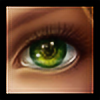
5. Add the eyes and any details that go with the eyes. ( I will include a realistic eye tutorial int eh future... in the mean time, just do the best you can. When you add the eyes, add anything that is attached to them, like tears or lashes or anything else.
6. Add the hair. Here is a link to realisitc hair making. Hope this helps. [link]
7. Back to the line art for doing clothes. In this case, I drew the clothes on a different layer from the other line art, but that is optional> Personally feel that by doing the line art in stages like this, you don't have to worry about if you alter the picture the line art not matching up any more, and that is why I do it that way.
I often use a green background for something I want to keep layered so that I can tell easily if something is sticking out in a way I don't' want it too, that helps to kept the edges smooth... this is kept on a different layer and made visible every so often throughout the drawing process to get things just right.
8. Base colors again... but with clothes I tend to do things slightly differently. I start with a flat color and then use lighter and darker colors with a pen that is partially transparent so that it has the light up look... Something to keep in mind when doing clothes... the folds are such that the darkest part and the lightest part of a fold often are side by side... I hope that made sense... It is more difficult to find references for clothes... so the best thing to do is to drape a cloth over an object and study that, borrowing some of its folding patters and light and dark pattern to fit the clothes that you drew... because often you will find a face you can use, but the person is not wearing what you want them to wear.
9. Just like before, smooth it out... add details, look at all the payers together without the line art and make sure everything is right.
I hope this helps you if you are interested in trying your hand at realistic art. Good luck, and have fun.
Before you start drawing realistic art... it is important to have good references. If you are experienced and practiced in realistic art, this may not be as must the case... I don't' know, but I do know that I still need references, and if you are just starting, you will need them too.
A few words about referencing:
While referencing is needed, it can be a tricky business... The closer a reference is to what you are aiming to draw, the more detail you can put into it... which is good, but if you are referencing something very closely, people usually want to know what you are referencing... at least that is how it is on the internet... That makes sense of course... but that can be tricky, because often times when you find the perfect picture, you may not know where it came from, or what you remember may not be accurate. I am mentioning this because it is easy to get into trouble for something you did not intend to doing realistic art. That something that you may get in trouble for is art theft. The best way to avoid getting in trouble for that is knowing where something came from, getting permission to reference it, and even altering the image to your own style or changing things in such a way that in the end it no longer resembles the reference... some combination therein is the best bet... but that isn't always possible. I honestly can say that I am not sure of the best procedure for using a reference you don' t know where it came from except to mention that you used a reference and you dont' know where it came from... though it may be tempting to leave that out... because it sounds silly... you might think (duh! I used a reference, you think I memorized what a person looks like that well when I've never done realistic art before? That is how I thought when I first started... but then again, you can never tell if you are offending someone by referencing their work and not saying where it came from... which also makes sense, because if someone referenced what you drew, wouldn't' you at least like to know about it and know that they aren't taking credit for it? I feel I have to write this up, because in my tutorial, I am telling you to reference, but I don't' want you to get into trouble for it... might seem like common sense to most people... but still... better safe than sorry, right?
Getting started:
Find a reference... or several if you need them... and get them set up. Open Photo shop with those references in different windows. You can keep them in different windows or you can make a quickly collage to help compose the picture... for example, if you are using a flower from one shot, a butterfly from another and an eye from a third, you can try putting them together on one picture that shows how they will all fit together so you wont' have to guess about the arrangement in the actual picture. After you have your reference or references set up how you like open a new folder with the size you want it... I suggest a resolution of 300 dpi at least, so you can get the little details right.
1.
When you are doing realistic art, you end with absolutely no line art... keep that in mind when you draw the line art... make it as accurate as you can, but don't worry about making the lines look refined or anything, sketchy and quick is best, because that way you can get onto the drawing faster.
If you are doing this with a mouse, you might want to trace the image on a separate layer and then copy and paste it on the page you plan to do your art in. I recommend this for mouse users only because I know hoe difficult it is to draw something decent with a mouse... coloring on the other hand is much more doable with a mouse... If you have a tablet, you should resist the temptation to do this because it works much more similar to how real drawing works and so you don't' need that extra help just to get it to look reasonable.
2. put the base colors on a layer under the line art. This is similar to cell shading... only you add more layers of shades than just one or two, and like the line art, you don't' worry about getting everything just perfect. You will be altering it later with the smudge too anyway.
There are multiple methods that one can use for applying the base colors, each with their own strengths and weaknesses. The first method is to use the dropper tool and select colors directly off of the picture you are referencing... this will get you a more accurate color palette... but if you do a good job, you may run the risk of making the image look like a paint over (where someone just paints on the picture itself or something like that... rather than drawing it all by hand) and while paint overs in and of themselves aren't bad (so long as you are not pretending you drew it all and you give credit to photos you used), but if you drew it from scratch, you probably want to get credit for that. The other option is to simply make up your own variation and or eyeball the colors you will need. This may result in a less accurate palette but people are more likely to recognize it as a drawing.
I have used both techniques... and I must say that for the most part a variation of the two approaches works best for me... where I sample a few of the colors to get a range and fill in the blanks on my own... in the end, I think that this is something you should figure out on your own.
3. using a smudge tool of about 25% strength, that is fairly large, start smudging the colors into a smooth looking surface. I suggest using a smudge at 25% because it is soft enough that it won't read every twitch of the finger and to completely alter the line. To get smooth flowing colors, have it weak. Also set the hardness to 0%, this will help with the smoothness as well.
Go over everything with the smudge tool loosely first, and don't worry about the details yet.
4. Hide the line art and look at the picture. Where are the details needed, what still needs more smoothing, what simply doesn't look quite right. Make those adjustments now. It is a good idea to use the dropper to select the color of the area you are modifying, and then with a small brush, draw in what you need and then with a small smudge, carefully blend in that line with the surroundings. If you got the proportions somewhat off or something like that, you can use the liquefy filter to push things into the place you think they should be. Do this in stages if you must, with just a little here and a little there... until it looks just right. It is important that you get this done before adding hair or eyes because liquefy will mess up the shape of the eyes and the flow of the hair.
5. Add the eyes and any details that go with the eyes. ( I will include a realistic eye tutorial int eh future... in the mean time, just do the best you can. When you add the eyes, add anything that is attached to them, like tears or lashes or anything else.
6. Add the hair. Here is a link to realisitc hair making. Hope this helps. [link]
7. Back to the line art for doing clothes. In this case, I drew the clothes on a different layer from the other line art, but that is optional> Personally feel that by doing the line art in stages like this, you don't have to worry about if you alter the picture the line art not matching up any more, and that is why I do it that way.
I often use a green background for something I want to keep layered so that I can tell easily if something is sticking out in a way I don't' want it too, that helps to kept the edges smooth... this is kept on a different layer and made visible every so often throughout the drawing process to get things just right.
8. Base colors again... but with clothes I tend to do things slightly differently. I start with a flat color and then use lighter and darker colors with a pen that is partially transparent so that it has the light up look... Something to keep in mind when doing clothes... the folds are such that the darkest part and the lightest part of a fold often are side by side... I hope that made sense... It is more difficult to find references for clothes... so the best thing to do is to drape a cloth over an object and study that, borrowing some of its folding patters and light and dark pattern to fit the clothes that you drew... because often you will find a face you can use, but the person is not wearing what you want them to wear.
9. Just like before, smooth it out... add details, look at all the payers together without the line art and make sure everything is right.
I hope this helps you if you are interested in trying your hand at realistic art. Good luck, and have fun.
Image size
1200x1001px 531.26 KB
© 2009 - 2024 manic-goose
Comments55
Join the community to add your comment. Already a deviant? Log In
I STILL SE YOUR SHADOWS IN MY ROOM, CANT TAKE BACK THE LOVE THAT I GAVE YOU, I STILL COMPLAIN THAT I LOVE AND I HATE YOU AND I CANNOT CHANGE YOU, SO I MUST REPLACE YOU OH.